
One tool critical for ensuring safety during emergencies are Evacuation Diagrams. Evacuation Diagrams provide clear instructions on how individuals can exit a building or area efficiently and safely in the event of an emergency, such as a fire, earthquake, or hazardous material spill.
Complicated Evacuation Diagrams
When putting together emergency responses, it can be tempting to think that you can’t provide too much information. However, when these diagrams become overly complicated, they can hinder rather than help evacuation efforts, leading to confusion and potential risks. Understanding why evacuation diagrams become complicated and how to address their shortcomings is essential for effective emergency planning.
What does a complicated Evacuation Diagram look like?
- Overloaded Information
Many evacuation diagrams attempt to convey excessive information, including detailed floor plans, multiple exit routes, fire extinguisher locations, assembly points, and even non-emergency-related details. While all this information may be thought to be useful, cramming it into a single diagram can overwhelm users. People in emergencies often have heightened stress levels, making it difficult to process complex visuals.
- Poor Design and Layout
A lack of standardisation in design can make it harder for individuals to interpret the information quickly. Cluttered layouts, inconsistent symbols, and illegible text contribute to the complexity of evacuation diagrams. For instance, using non-standard symbols or colours can confuse people unfamiliar with the building or the diagram’s design.
- Language Barriers
If the text dominates the diagram, it detracts from the clarity of the visual components. In multilingual environments, evacuation diagrams often include instructions in several languages. While this inclusivity is important, it can result in a crowded and complicated display. This is why universal symbols work so well.
- Complex Building Structures
In large or uniquely designed buildings, such as hospitals, shopping malls, or industrial facilities, evacuation routes may involve multiple floors, staircases, and restricted-access areas. A diagram positioned on entry to a staircase can guide people to the next stage of the evacuation, instead of trying to work out the entire route from one diagram.
- Technological Overload
Some diagrams incorporate QR codes, augmented reality features, or interactive elements meant to enhance understanding. While innovative & informative when viewed in a non-emergency context, these additions can confuse users who are not technologically adept, particularly in urgent situations where simplicity is paramount.
Risks of using complicated Evacuation Diagrams
When evacuation diagrams are overly complicated, they can create significant risks during emergencies:
- Delayed Response Times: Confused occupants may spend extra time trying to interpret the diagram, delaying their evacuation.
- Panic and Stress: Unclear instructions can increase anxiety, particularly in high-pressure situations.
- Misinterpretation: Individuals may misread symbols or follow incorrect routes, potentially putting themselves and others in greater danger.
Strategies to Simplify Evacuation Diagrams
- Standardisation
Using standardised symbols, colours, and layouts helps ensure consistency across different diagrams. Universal icons for exits, fire extinguishers, and emergency routes are more likely to be understood by a diverse audience. - Prioritisation of Information
Highlighting the most critical information (required information)—such as primary exits and evacuation routes—while removing less urgent details can make diagrams easier to understand. Optional information can be included separately or on a case-by-case basis given the risk for the workplace. - Clear and Minimalist Design
In an emergency, the number of cubicles in the toilets is not of importance. What is important is being able to see that the room is a toilet. A staff room doesn’t need tables included. Employing a clean and uncluttered design with ample white space improves readability. Diagrams should feature large, legible fonts and clear directional arrows to guide users effectively. - Interactive and Layered Approaches
For complex structures, layered diagrams that present information in stages (e.g., floor by floor) can be more user-friendly. Interactive elements, such as digital kiosks, can offer additional details without overwhelming static diagrams. - Regular Testing and Feedback
Conducting evacuation drills and seeking feedback from occupants can identify potential issues with diagram complexity. Testing ensures that the diagrams are functional and understandable under real-life conditions. - Orientation
Do the diagrams clearly show you where you are in the building space with respect to the layout on the diagram? Is the diagram in a prominent location for all occupants to identify it and use it effectively?
Complicated Evacuation Diagrams can undermine safety by causing confusion and delays during emergencies. Diagrams must meet compliance standards. To address this issue, designers must prioritise simplicity, clarity, and universal design principles. By focusing on the needs of users and tailoring diagrams to specific building layouts, evacuation diagrams can be transformed from potential liabilities into life-saving tools.
Workplace Emergency Management can help you with your Evacuation Diagrams. Get in contact with our friendly trainer consultants today!
GET IN TOUCH
Are you ready for peace of mind that your workforce is as safe and prepared as possible?
With a dedicated team of staff ready to help you meet compliance requirements and improve the overall safety of your workplace, all you need to do is get in touch.
Request your free audit today!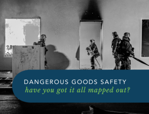

